


Roasting My Old Photos so You can Learn from My Mistakes
Out-of-focus, tilted, crowded and orange-tinted not proud moments

Today I am exposing some of my least perfect photos to show you what not-to-do. We are taking a trip back to shameful lane and I am inviting you to join me.
I am quite the perfectionist type so it doesn’t make me super comfortable to show you work that I am not really proud of. But I think it’s an interesting exercise to analyse what works and what doesn’t and it also makes me proud to look at the images I can create now seeing where they come from. We all start somewhere, and the learning process is a fun one!
I recommend you to check out some of my previous posts on photography fundamentals if you need more context:


I always try to include everyone’s journey in my tips, so a fancy camera is by no means necessary! Everything can be applied just with your phone camera. It’s all about knowing how to use the natural light available and how to style your scene.
I normally focus on food photography and styling but some things we’ll discuss today can also be applied in other kinds of photography.
Let’s get down to business (and to my mistakes)…
Note: Many of the following photos feature East-Asian food as I began taking photography seriously while living in Thailand and starting my project Canela Limón Chile, 6 years ago.
Missing the focus
A big beginner’s mistake is to have your food or subject out-of-focus. It’s important to understand what is it you are trying to photograph and then make sure that element is sharp and visible.
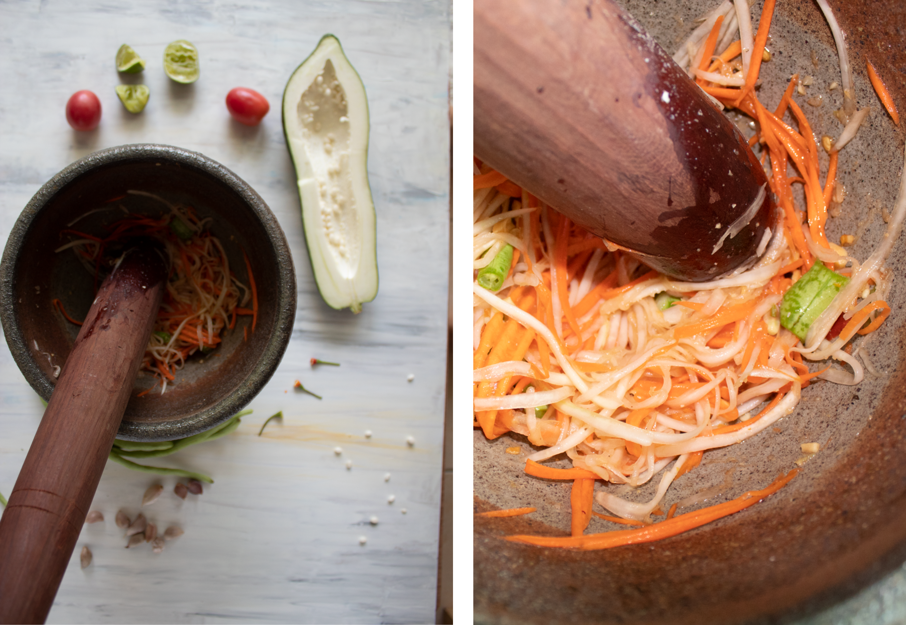
Troubleshooting: A tall object
In the following examples we can see how I tried different options aiming to photograph the ingredients of a som tam salad. I wanted to include the mortar, but the traditional one used in Thailand is a very tall one, as you want all the splashes from the sauce and juicy ingredients to stay in the pot. This meant I had to work with two different heights: the surface of the table where the rest of ingredients where, and the tall mortar.
I didn’t know much what I was doing. I was shooting in automatic mode, as I didn’t understand any of my camera settings. This meant the machine chose for me. It chose what to focus on, and it didn’t always coincide with what I had in mind.
Thankfully, I kept on trying different angles and rearranging my scene a bit until I found some good shots.

How-to
Most modern phones have different built-in options for focus. If you choose the normal “photo” one, you’ll get a much wider area of focus, which means, most elements will appear sharp. If you prefer to have one element in focus and the rest blurred out, you can choose the option “portrait”. But then make sure that your subject is the one selected! You do that by gently tapping on the part of the screen where the object is.
Tilting objects
Another common mistake is to choose certain angles to photograph your subject that will make it appear tilted. This is specially relevant for objects with clear lines like bottles and also for table tops. If your horizon line is not perfectly horizontal, it is not quite right.
Troubleshooting: Bottles
Enjoy this compilation of not-straight bottles…

How-to
An easy solution to this may be to take some steps back and position your phone/camera at a lower height, so instead of taking the photo at an angle, it is straight-on. You can also correct minor tilts later on if you edit the photo. Most phones have editing options embedded, but I use Adobe Lightroom, which is free to download as a phone app.
Troubleshooting: Leaning tables
If you want to take a photo of a beautiful spread or just the top surface of something, it’s best to position your camera on top of it. This angle is called lay-down or top-down. Now, the problem will be that if your camera is not straight, the table will appear leaning, which creates a strange sensation.

How-to
This takes some practice, specially if you are photographing freehand — with a tripod you have more control—. A good visual cue is to look for the edge of the table, and to try to get it straight in the camera viewer. If you can get a corner is even better as you’ll have more reference to straighten your image. If later on you decide you don’t like that edge, you can crop it out the photo.

No breathing space
Many times it’s really lovely to get a very snug close up of a detail, but it’s often a good idea to also have other shots that are a bit more spaced out.
In design terms, this is called “negative space”. And it’s an area that is not filled by any element in the photo. This helps us pay more attention to the elements that fill up the rest of the space and it balances out the weight of the image.
Sometimes, it’s not even necessary to leave negative space per se, but just leaving some areas not too crowded is enough to make the image more appealing.
Troubleshooting: Crowded scenes
A mistake I used to make often was to get my camera too close to the objects and gather them all together. This feels a bit too cluttered and even claustrophobic.
How-to
This can be solved with taking a step back or with raising your hands higher if taking a top-down shot. You can also play with the composition so not every object is touching each other. I am thinking about talking about composition for food photography in a coming neewsletter, let me know if this is something you’d be interested in knowing more of!
Relying on any light
The last mistake we are going to talk about today (believe me, there’s many more… should we do a part 2?) is not considering your light source.
For natural light photography — which is what I do 99% of my time and is free to use—, is very important to have your subject close to a light source (a window) and to turn the rest of lights off. This means only relying on the window’s light and not on the artificial lights around the space, specially not on ceiling lights.
Troubleshooting: Not controlling the lights
I used to shoot a lot in various locations when I started my research project Canela Limón Chile. I would take many food classes in different countries and photograph the process and the final dish to show in my website later on. I had no control of the lights most of the time, so, as a result, I ended up with lots of orange-tinted images.
How-to
If you cannot turn the artificial lights off, try to see if you can get your plate close to a window or walk outside the room. See (below) how different the overall color of the dish looks in different lights? Ceiling lights have a very un-appealing tint and create almost no contrast, which makes the food feel fake and strange.

Passing the ball
If you liked examining these photos of what didn’t work, I invite you to do the same with yours! I have learnt as much inspecting other people’s beautiful photos as doing so with my not-so-pretty ones.
As part of my paid subscriber plan, I privately critique subscriber’s photos pointing out what to change next to make the images more compelling. Next Monday, we will also have our office hours — which are held once a month in the private chat— and we’ll discuss about various topics, from photography to writing, storytelling and recipes. I would love for you to join us if you think it’d be something you’d like!

I also think it would be very interesting to do a similar exercise as I did today with some of your images, so this becomes a collective learning experience. Let me know in the comments if you would like to participate, and I’ll send out my email to receive the photos!
To wrap it up
To wrap it up, here’s a summary of what we’ve been talking about:
Make sure you know what you want to photograph and focus on it.
Remember to get your camera straight so your scene doesn’t look tilted.
Try to play with the space between the objects and get different shots (close up and general ones).
Turn off all artificial lights if possible and get your subject next to a window.
Refect on what doesn’t work in your own photos and send them to me if you need some guidance!
Have fun experimenting and tag me in your photos so I can see them!
I have been on a photography journey with my Substack. And this piece is really well written and communicated beautifully. Thanks for breaking it all down. I am looking forward to applying some of your techniques.
Thank you for this great piece! Good tips in here, particularly around getting things straight. I look forward to your composition piece soon.