Tips for taking better photos: Learn From Art
A journey to my favourite art pieces and to what I learned from them
Being confident in your composition is one of the most difficult things when you start engaging in photography. You can learn it all about the light and the technicalities of your camera and even then your photos could lack interest. And this is because your creative eye needs to be trained (and practised) a lot for you to decide what to capture and how.
I wrote an article about the similarities between photography and interior design before, and today I want to talk about art and how we can learn from it if we know what to look at.
I think now that for many of you is a time for vacation and leisure, some guidance on what to pay attention to the next time you visit an art museum could be helpful. And the more you observe, the more you will start noticing composition techniques that then you can apply to your own photos.
Travel with me to some of the best museums in the world and explore my favourite art pieces so we can learn from them together:
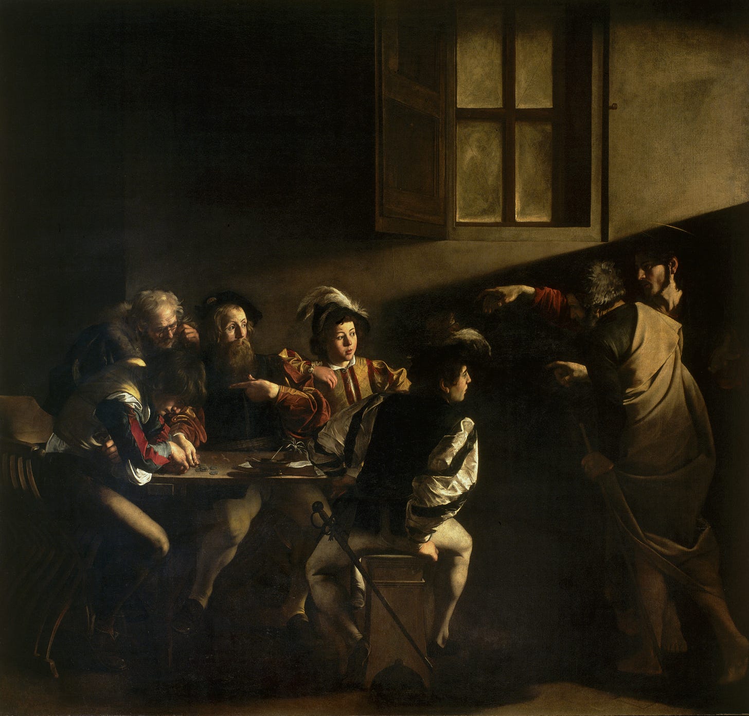
Caravaggio, Vocazione di San Matteo, 1599-1600 (San Luigi dei Francesi, Rome)
The Italian baroque has always seduced me but it was after taking a class dedicated to the matter in university that I felt entrapped. I learned about all the nuances in color, light, composition and technique and got captivated by many artists. After finishing the course, some friends and I took a trip to Rome to soak everything we had learned. There’s no better city in the world to experience the Baroque. And one visit you must pay if you are there is to the church of San Luigi dei Francesi, where you’ll find 3 Caravaggio in the Contarelli Chapel.
The painter was commissioned a series of 3 works based on the life of saint Matthew. And they are all exquisite, but perhaps my favourite is The Calling of Saint Matthew, on the left wall. It depicts the moment Jesus calls on the tax collector Matthew to follow him, to become his disciple. The scene in set in a tavern and illuminated only by a window that is outside the frame, which light forms a perfect diagonal that passes through the pointing hand of Jesus to the table illuminating Matthew.
Aside the fantastic play with light and dark, called chiaroscuro, what we can learn from this is the use of guiding lines to draw the viewer’s attention to the main subject. A diagonal line crossing the frame will make the scene more dramatic and dynamic, while parallel ones meeting at a vanishing point will provide a sense of depth and perspective.
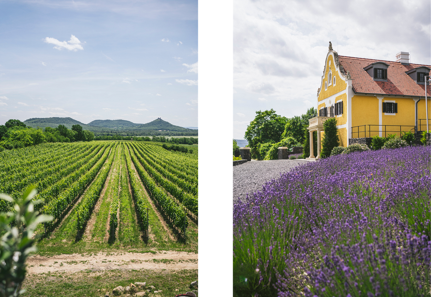
Goya, Perro semihundido, 1820-23 (El Prado, Madrid)
From the city of Rome we go to the Spanish capital, Madrid. There you’ll find many world famous museums, but a personal favourite is El Prado. Every time I visit it, I spend most of my time around their large collection of Goyas. Francisco de Goya y Lucientes was a royal painter, though some of his most interesting work remained private. The series of 14 mural paintings called “pinturas negras” (black paintings) populated his private residence outside Madrid called Quinta del Sordo. They are black not only in color but also in topic. Some titles are: Fight with Cudgels, Witches’ Sabbath, Man Mocked by Two Women and Saturn Devouring His Son. You get the feel.
One that shocked me specially, for its simplicity, was Perro semihundido (“half-sunken dog”), also translated as The Dog. It’s a tall and slender scene, painted in a light warm ochre in which we see the head of a dog in the bottom looking up as if desperately trying to emerge to the surface. It would be an abstract painting if it wasn’t for that anxious face. Which makes it very impactful.
Getting away from the grim mood, what I take from this is the power of simplicity and the use of monochromatic tones. Also, Goya applied a very powerful composition technique here called the Rule of Thirds.
If you divide an image into 9 equal parts by 2 equally spaced horizontal lines and 2 equally spaced vertical lines, you have a visual aid on where to place your subjects. It is thought that aligning a subject with these points creates more tension, energy and interest in the composition than simply centring the subject. Here, Goya takes it to the extreme. Only adding one single subject, and deciding to do so in the corner left of those intersection points. By having him on the left, the viewer imagines that the dog still has a way to go (there’s space in the canvas on the right), as in Western countries, our eye goes from left to right.
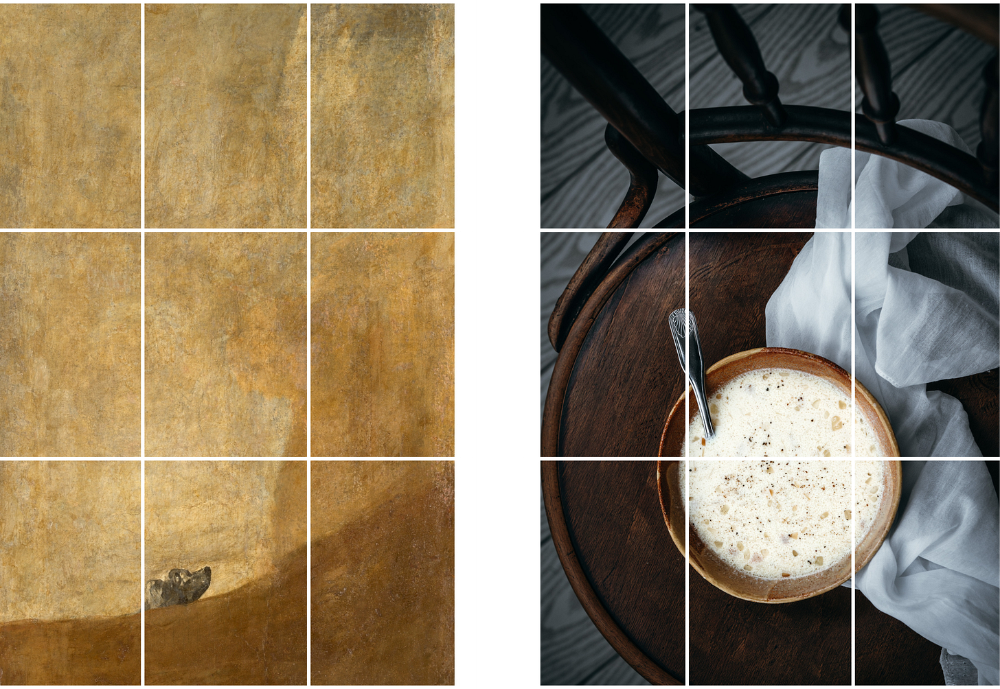
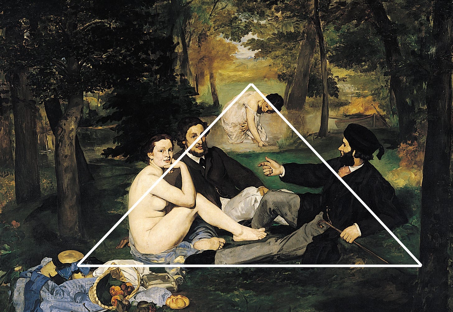
Manet, Le Déjeuner Sur L’herbe, 1863 (Musée d’Orsay, Paris)
Taking another trip, this time to Musée d’Orsay in Paris, we’ll find a masterpiece that was considered a scandal when it was first exhibited. Actually, Manet’s painting was first rejected when he presented it at the 1863 Salon, and so he ended up showing it at the Salon des Refusés (the Salon for the rejected) instead. It provoked laughter and defamation because of the painter’s boldness of presenting a feminine nude among clothed men. It had been done before, for sure, but never without the excuse of mythology or allegory.
The style was also shocking as he made no transition between light and dark elements, creating strong contrasts that were very strange at that time. And very little depth and perspective are found in the woods, which was deliberate as Manet was searching a new freedom from traditional modes of representation.
One composition technique that appears clearly here and that I try to keep in mind when I am in a creative block is the use of the Triangle. The frame is divided into one or several triangles, which is used as another visual aid so you can fill up one (or two) of the triangles with the subject or use the lines instead so elements run along them.
The triangle here is slightly off centre, which makes the scene more real, while keeping it very pleasing as this is is one of the most basic shapes we can immediately recognise.

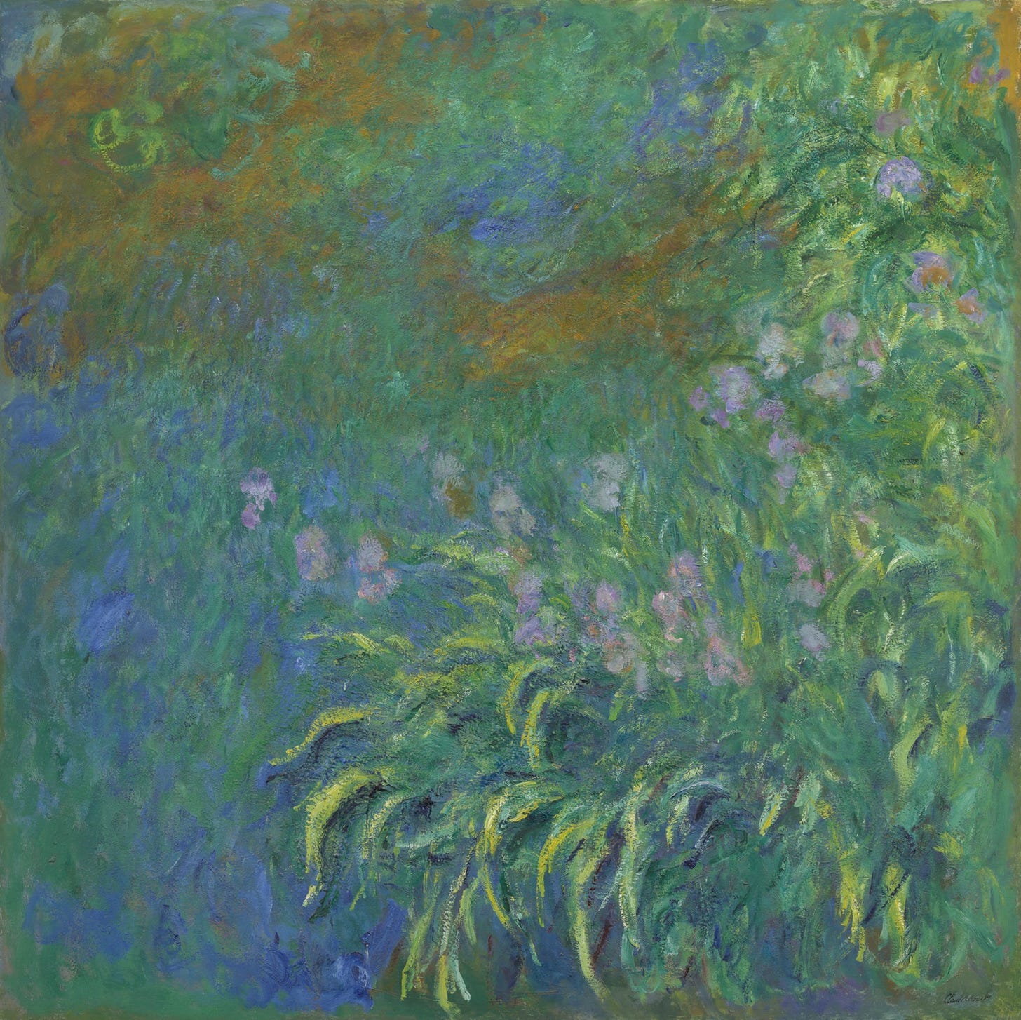
Monet, Irises, 1914-17 (Art Institute of Chicago, Chicago)
From Manet to Monet, and from Paris to Chicago. Manet was a key player in the transition from Realism to Impressionism as he dared to break some classical schemes that then other painters, like Monet, would follow on.
Monet is one of my favourite painters of all times. To me, his work conveys strong emotions with just some colors and almost no figuration. And when I first studied him in university, it touched me deeply to discover that he was committed to observe nature and represent it accurately. Expressing the distortions of sight and light, and even eliminating perspective. As a girl that used to wear glasses and saw very little without them, his paintings were an expression of my world without the aid. The blur was my reality.
Recently I marvelled myself with the discovery of a painting of his I didn’t know existed. It was on a short trip to the Windy City. Ross and I stopped at the Art Institute of Chicago before taking a long train to San Francisco. And it was more than just killing a couple of hours. I definitely will be coming back.
I could have just stared at this piece forever. It transported me to a land of fairytales and mysterious gardens. It’s one of the most abstract compositions that I have seen of Monet, and maybe that’s what attracted me so much to it. And its size. It’s huge! It covered the height of a full wall in the museum.
Sometimes you don’t need to examine an art piece for ages to learn from it. Sometimes it’s all about a feeling, an emotion. And for me, there’s something about that color palette: blues, greens, purples, ochres… It’s so soothing.
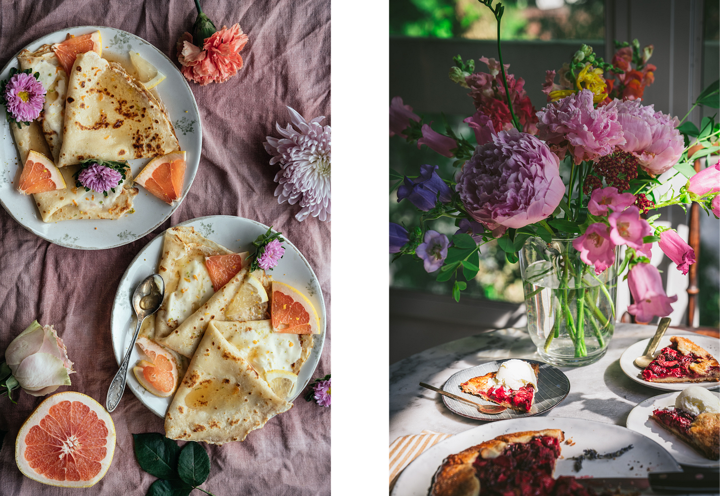
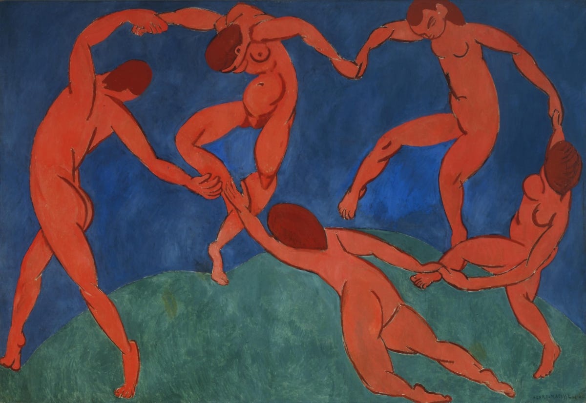
Matisse, Dance, 1909-10 (Hermitage Museum, Saint Petersburg)
I have never been to Saint Petersburg but I have seen a study of this final painting in the MoMa, NYC. Matisse had a breakthrough moment after this piece, he focused on the expressive potential of fundamental elements: line, color and form. And actually this excessive simplification was influenced by the sophistication of photography. When photographs could render specific details of reality, art was left to express emotions directly.
“The painter no longer has to preoccupy himself with details. The photograph is there to render the multitude of details a hundred times better and more quickly. Plastic form will present emotion as directly as possible and by the simplest means”. Henri Matisse
What I take from this is the search for simplicity through color and shapes. I love complex compositions, but at times, it’s good to step back to the essentials. And find movement that will draw the eye through your image.

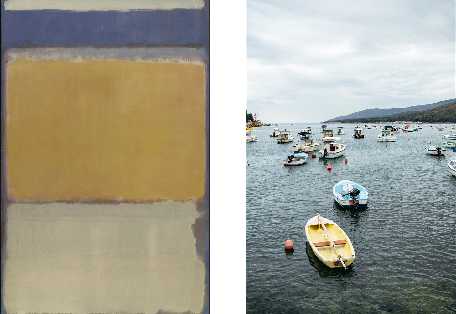
Rothko, No. 10, 1950 (MoMa, NYC)
From Russia we come back to the United States to discover this last piece we will be talking about today. We took a journey not only through different cities and museums but also through the ages and from complex images to more and more simple ones. But as we have just seen, simple doesn’t mean bad. Sometimes it’s quite the opposite.
I remember a teacher I had in school that used to try influencing us to work hard by saying “you need to follow the rule of minimal effort”. Find the way to say things with less words, to finish the task with less steps, so you work less because you have been working smart.
I feel with some art, what we are witnessing is the artist working smart. Getting the viewer to experience simplicity but still something deeply moving. And I think this is the case with Mark Rothko.
“I’m interested only in expressing basic human emotions— tragedy, ecstasy, doom, and so on. And the fact that a lot of people break down and cry when confronted with my pictures shows that I can communicate those basic human emotions….If you…are moved only by their color relationships, then you miss the point.” Mark Rothko
Having his pieces move you or not, doesn’t really matter. We can still have our take on them. For me, each of his compositions hit me in a different way, but taking composition No. 10 as a reference, what I can see is his use of a 50-40-10 rule to divide the canvas. We find 50% dedicated to a neutral color, 40% to a warm ochre and 10% to a blue accent, that at the same time is contrasting with the yellow making it pop.
His color blocks compositions are very engaging to me, making me think of new combinations that I can use in my photos to convey specific feelings.
To wrap it up
To wrap it up, here’s a summary of what we’ve been talking about:
Visit museums and art galleries to get inspired by the different pieces.
Start recognising composition techniques like the use of guiding lines and triangles and the rule of thirds.
Keep in mind to leave negative space to centre the attention to your subject.
Play with movement by placing your subjects in different places of your frame so the eye moves around your image.
Get moved by colors and emotions and try to see what is it that attracts you of a certain image. You can take that monochromatic look, that specific color palette or blocks of color into your photos.
Have fun experimenting and tag me in your photos so I can see them!


Loved learning about these concepts! I definitely need to pay more attention to shapes when I'm taking photos. The 3 bowls in your photo form a triangle, which keeps giving your eyes something to look at. It's all in the details.