What Learning about Photography Taught me of Interior Design
The easy composition rules you can apply to both arts
An untold truth about me is that I am kind of obsessed about interior design. It is not something that I have shared on my Instagram before because it’s unrelated to what I focus on there which is mainly food, history and traditions worldwide. Still, on my leisure hours I spent a lot of time reading about it, looking at online magazines for inspiration and watching DIY YouTubers. I also may spend some money in new pillow covers to change up every season (which some may consider unnecessary and I think it’s essential…).
When I started taking an interest in the topic I realised I recognised all the tips the professionals where giving about how to decorate your home harmoniously. They all sounded very familiar because basically they were techniques I was already applying in photography.
Here are my favourite basic composition rules to use both in interior design and photography:
Achieve a sense of balance
Can you think of a time when you entered a hotel lobby, someone’s house or a restaurant and thought “it feels so nice in here!”? It was probably because the room was well balanced.
To achieve that, there are different tips you can use, and they work the same when you take a photo. You just have to keep them in mind when you are decorating a shelf or when you have your camera in hand walking around a new city.
Leave negative space
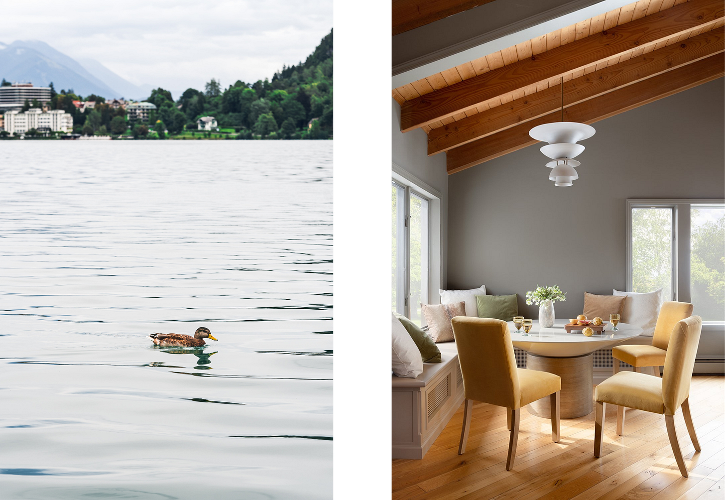
Negative space refers to the empty space around the subject(s). A busy scene sometimes can feel chaotic to the eye, so if you want to accentuate something (it being a subject to photograph or a nice object in your house) it’s better not to clutter the area and leave some “blank” space around it.

Symmetry and Asymmetry
The eye likes symmetrical things. They make us feel balanced because in nature, symmetry means good genes. So it’s nice to play with symmetry in your designs, but it could lean to be boring. Because it is what makes us feel the most relaxed, the viewer could just divert attention very easily. On the other hand, if you use asymmetry instead, you are creating visual interest, and because it is different we want to stay there and keep on looking. It being an image or a room.

The “rule” of odds
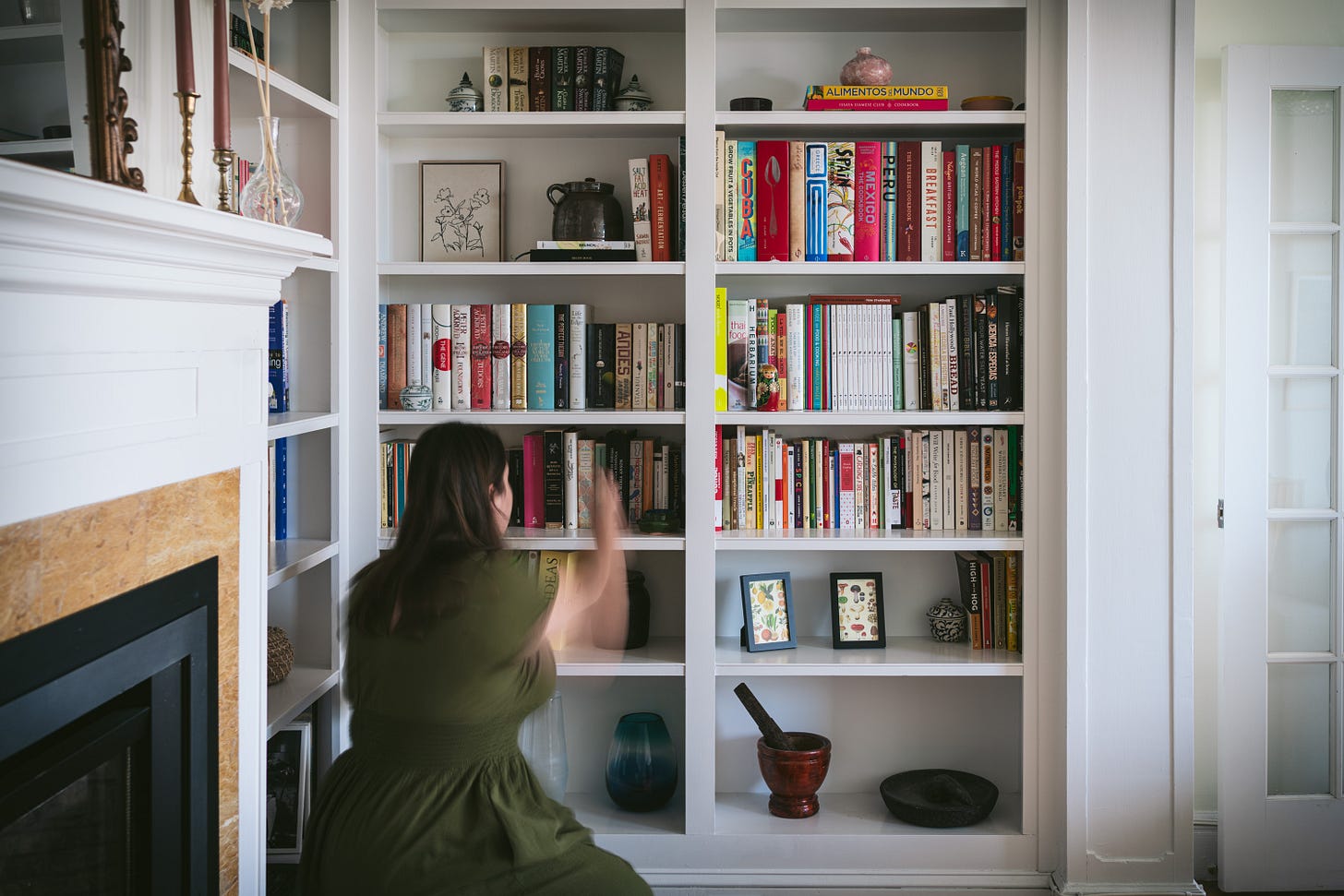
Another way to create interest (and this is linked to the asymmetry I mentioned before) is to create little vignettes with objects that sum up to odd numbers: 3 cupcakes, 5 books, or elements grouped in 3 irregular clusters, for example. An odd number of elements in a frame or scene is more visually pleasing for the eye than an even number.

Create rhythm and visual flow
As I was saying, we not only want to achieve something balanced but also interesting. A scroll-stopper. We want the viewer to stop and look at our creation, and we want them to stay there for a while. To do so we can guide the eye of the viewer through the scene with the intentional placement of our subjects.
Repetition
A great way to guide the eye is by repeating a certain accent color or shape throughout the space. If it’s a pop of color and it’s positioned in different areas of the room or photograph, the eye will naturally follow it creating a pathway around your space. In food photography, repeating the subject also is used to create a lot of visual interest as it feels harmonious.

Use lines to lead the eye
Lines in photography help the viewer lead the eye through the background to our subject. The same can be applied in interior design with patterns and objects.

Pay attention to your colors
Interaction Design Foundation defines color theory as “a concept used in visual arts and design that explains how colors interact with each other and how they can be combined to create certain feelings, moods, and reactions”.
Knowing how to use the color wheel to your advantage will be very beneficial in your overall design.
Monochromatic
This doesn’t necessarily mean black and white but keeping the design to a main color and their different shades, tones and tints. For example, you could choose to design in beige and incorporate browns as well.

Analogous
Analogous colors are the ones that are next to each other in the color wheel, for example green, orange and yellow. They will make your designs feel harmonious.

Complementary
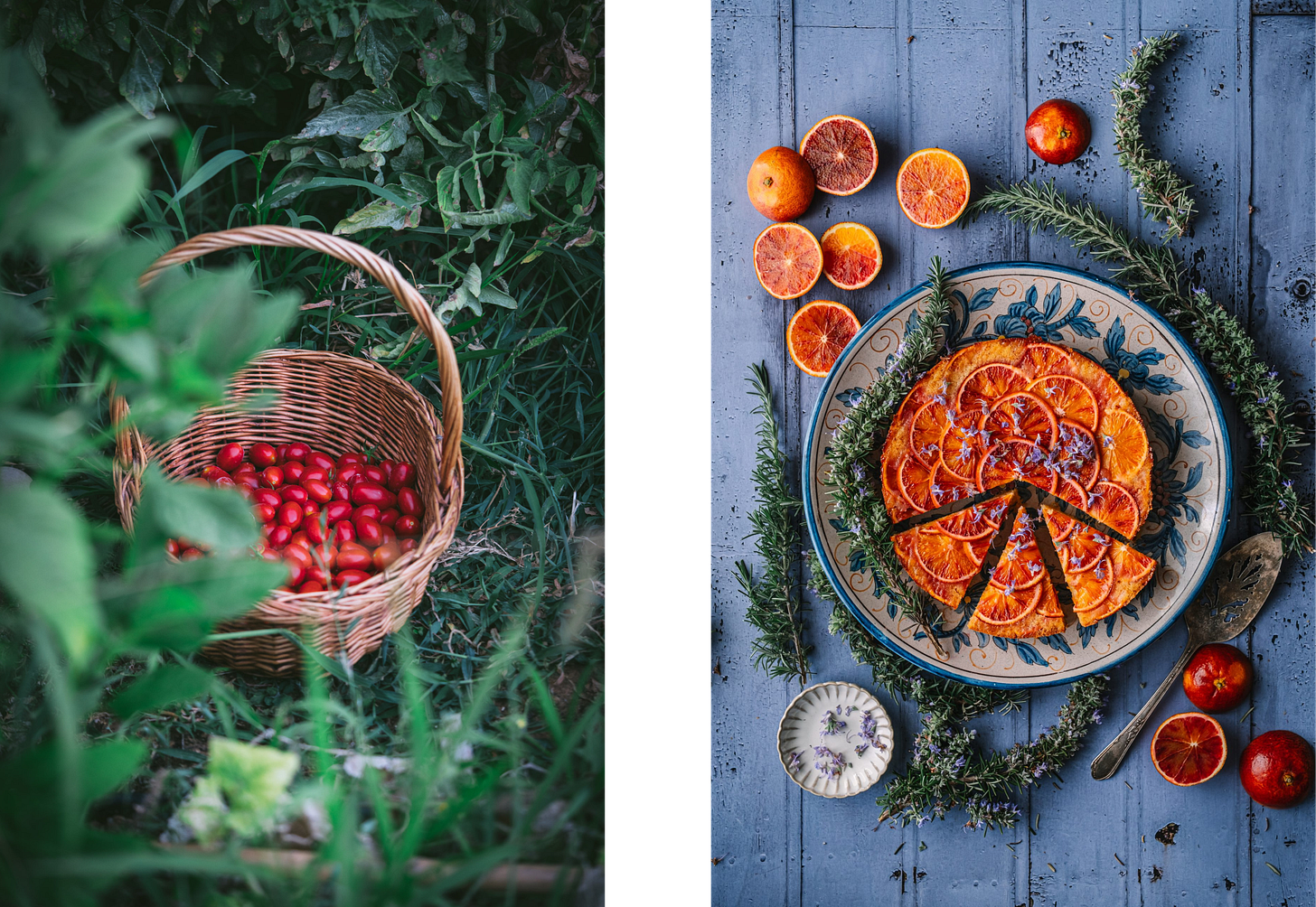
These colours are opposite in the color wheel: blue-orange, yellow-purple and green-red. When paired together, they make each other pop, adding contrast and energy to your image or design. They don’t need to be in full-saturation, but image having a room painted in a muted forest green and incorporating some pillow-cases that are a burgundy red.

The unexpected red theory
There’s a big discussion in interior design forums right now about a new theory that says that if you add a touch of red to your space, you will instantly feel invigorated and it will make it look more attractive. And of course it works.
This has a psychological explanation: red catches our attention. Blood is red, therefore the color is a watch out sign in nature. This is why stop signs and stop lights are red, as are fire engines and the flashing lights of emergency vehicles.
When the rest of the space is calming, a pop of red will catch our attention and make us wonder.

Add layers
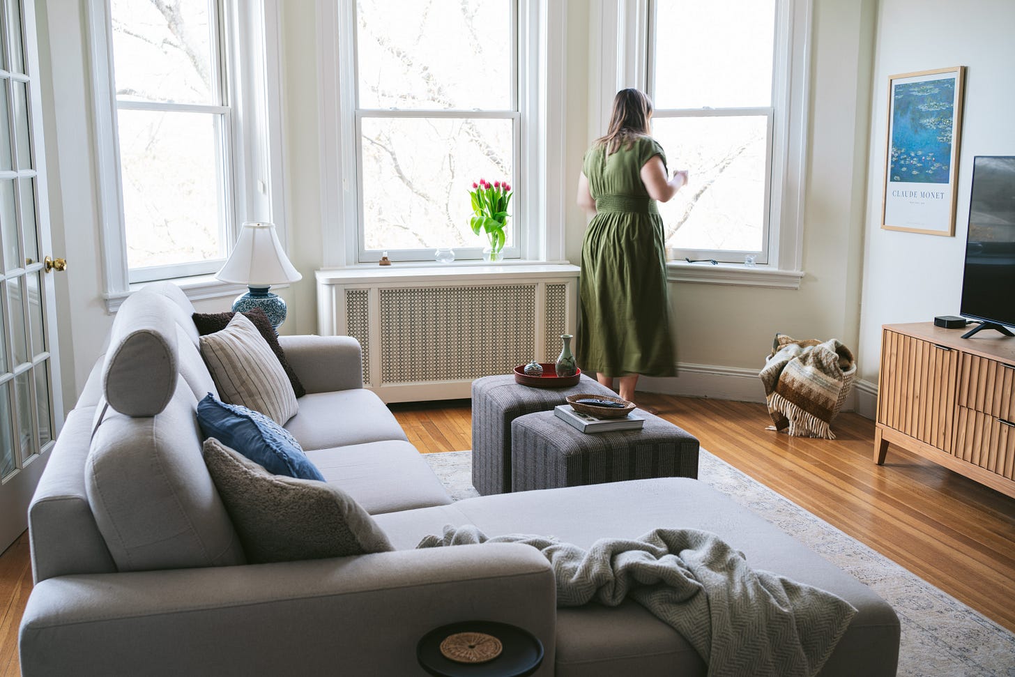
This is specially important in photography as it is a 2D medium, but also it is used in design to crate more visual interest. Layers bring texture and make images more inviting, keeping them from appearing flat. Think of a thick blanket on your sofa during winter or a bowl of noodles with many components in it. We will want to keep on looking at that image for sure.

To wrap it up
To wrap it up, here’s a summary of what we’ve been talking about:
To make a photo/room feel balanced: use negative space, play with asymmetrical compositions and apply the rule of odds.
To find rhythm and visual flow: use repetition of colors and objects and lines that lead the eye to your main subject.
Keep in mind the color wheel when designing to get a specific mood.
Add layers to make your space or image feel more interesting instead of flat.
Let me know if you knew of these techniques and if you think you will apply them from now on! Maybe you will now start seeing leading lines everywhere! At the end of the day, it’s about training the eye to pay attention to all these little details. And for me, this is the best part about admiring a great photography or being in a space that drew my attention: seeing that it looks effortlessly balanced but knowing all the carefully planned decisions that led the artist there.


Really enjoyed these food photography — interiors parallels! Wonderful article