How I Shot This. An Ingredient Page for a Magazine
I take you through my thought process behind the creation of a page for a food magazine
At the beginning of July I participated in the creation of a series of recipes for a magazine that was published recently. You can check it out here.
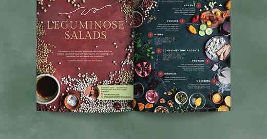
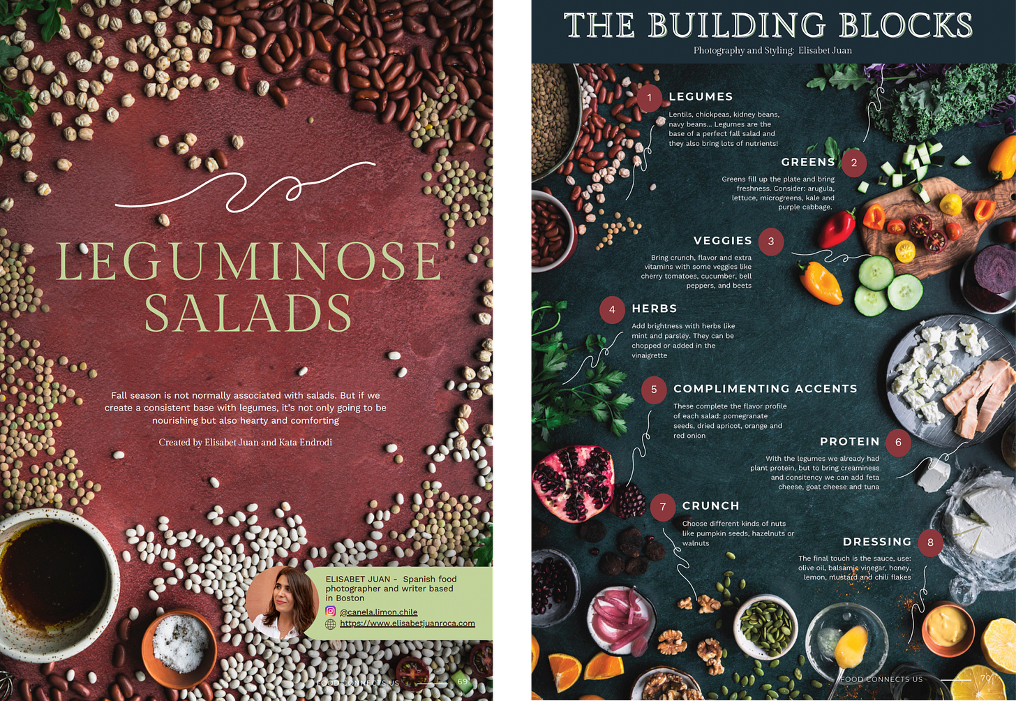
The brief was to present a recipe (or various) of a salad that spoke of fall. With fellow food photographer Kata Endrodi we agreed to incorporate legumes as the base for all the salads and then compose each with different fall flavours. As she lives in Montreal and I in Boston, we chose to divide the work and each create 2 images. I would make the first page of the series and the ingredient page explaining the building blocks needed to compose all 4 salads. She would make a double page with the final styled dishes.

The mood, story and color palette
Kata and I had many calls before we started shooting. The fist step was to decide the mood and color palette we wanted to represent. It had to be very clear for both of us as we were creating the images separately but they had to belong together.
I always start gathering inspiration in Pinterest and Instagram, though this time I also browsed many cookbooks and magazines to see what other creatives had done. You can see how I did it in my previous Behind the Scenes and Hot I Shot This newsletters.
I created a shared Pinterest mood-board where Kata and I could brainstorm ideas. Finally, we opted for a cool background with touches of green to contrast with the legumes that would be mostly warm-coloured. For the first page of the series, the one that would introduce the topic, I decided to go monochromatic, taking the terracotta tone of the beans and incorporating it to the background. The following page would be the ingredient one, and so it would contrast nicely.
We also agreed on the style. We would choose organic and artisan crafted props (objects used to support the food like cutlery, ceramics, cutting boards) in dark colors to let the elements of the salad be the main focus of attention.
The composition
My task was to focus on the ingredients. I took inspiration from the images below and I decided to spread the components by groups at the edges of the surface so the centre would have negative space for the text.

For the ingredient page, I had in mind the importance of each group for the placement. I knew the legumes had to be in the top left of the image. As we read from left to right and from top to bottom, it would be the first thing we would notice. Intentionally, as it was the base of all salads.
The rest of the groupings were positioned by importance but also taking into consideration the colors. I wanted to guide the eye of the viewer not only though the text but also all around the image placing the same colors diagonally and forming triangles (notice where the purple ingredients, the green and the yellow are positioned). This composition technique is used to create dynamism in the image because our attention is directed to different places.

I struggled a little bit with understanding the proportions and the real space the text would take. But I knew I wanted an organic looking image, so you’ll see some elements entering part of the negative space rather than all being within their margins. As well, the elements are cropped at the edges, making it look like the scene was much bigger than it actually was. It feels more lived in even if it’s a very stylised and planned image.
For the first page, it was important that the message was clear: it was salads with legumes. So the beans, lentils and chickpeas dominate all the edges of the scene but I also wanted to add some elements to show it was salad recipes. This is why there’s a vinaigrette bowl on a left corner and some leaves and tomatoes that will tie in with the following ingredient page.

The Editing
Both Kata and I took our images in natural light, on cloudy days so the light came naturally diffused to us. We then edited our photographs individually paying attention to certain details.
It was July when we prepared these images. Summer was at its peak and we fancied bright colors and sunshine. But we knew this series was about fall, so we kept in mind the mood of the story.
The ingredients would be naturally colourful, we only needed to edit the image in a way to darken the backgrounds so the main elements could shine. This is the reason why I desaturated and removed the highlights on my green backdrop. I wanted a more subtle tone that could let the other greens and reds pop, keeping the texture but without being distracting. I did the same, to a lower extend, with the terracotta backdrop. That one was already more muted but I changed the tone a bit to match the beans better.
I added some contrast and shadows and created a vignette around the images to darken the edges. This makes the rest come to live and focuses the attention of the viewer in the centre (where the text was to be). In the ingredients page, I also removed highlights from the white elements (cheese and cucumbers) on the right - where the light source was-, and accentuated ingredients from the left (herbs, chickpeas, pumpkin seeds and orange slices) so they felt more inviting.
I hope you enjoyed this edition of “How I Shot This”. It was a very interesting challenge to have to compose an image with lots of negative space left for text. I am looking forward to doing it again! You can download the magazine for free and browse what other creatives did! There are many recipes as well as photography tips and recommendations.

I am happy to answer any questions and if you felt inspired and want to practise some composition techniques, tag me on Instagram so I can see your creations!


You did a wonderful job balancing the imagery and text. It keeps you engaged and interested in learning more!