How I Shot This. A Mediterranean Appetizer Spread
I take you through my thought process behind the composition of this vermut table spread
Recently I composed a set of images to represent la hora del vermut, a very Spanish tradition of taking an aperitif before lunchtime. I took these photos to illustrate one of my comfort food moments as an expat that connects me with the Mediterranean sun and the layback Sundays in Spain.
I thought it would be fun to show you the behind the scenes of this shot and to explain my thought process for this composition, so maybe you can apply some of these ideas as well.
It’s worth noting that all the images, except the last one, are unedited. This meaning, they look like this straight-out-of-camera before any processing on the computer.
The mood, story and color palette
As I mentioned in my previous Behind The Scenes newsletter, I normally always start a shoot gathering inspiration for the mood and the story. This normally means going to Pinterest and Instagram and browsing the work of different photographers. I never copy the exact image, but rather get an idea of the kind of light used (is it soft, harsh, direct, indirect…), the composition and the colours that may go well together.

For this shot I wanted to challenge myself to play with color. I have a photography vinyl backdrop at home I have only used once because it’s in a strong blue color, but I was decided to use it now. It represents a blue wooden table and I thought you could easily find one in a bar’s terrace facing the sea in Spain.
The story I wanted to tell with the photo was of a beautiful spread shared on a sunny day before lunchtime. I was shooting this in my home studio in Boston (United States) so I had to find ways to represent the Mediterranean and its vibrancy. To do so I gathered props (plates, bowls, forks, glasses) that would work well with my background table and that would convey a feeling of being in a sunny region.
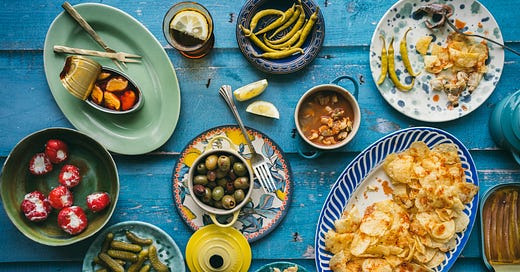
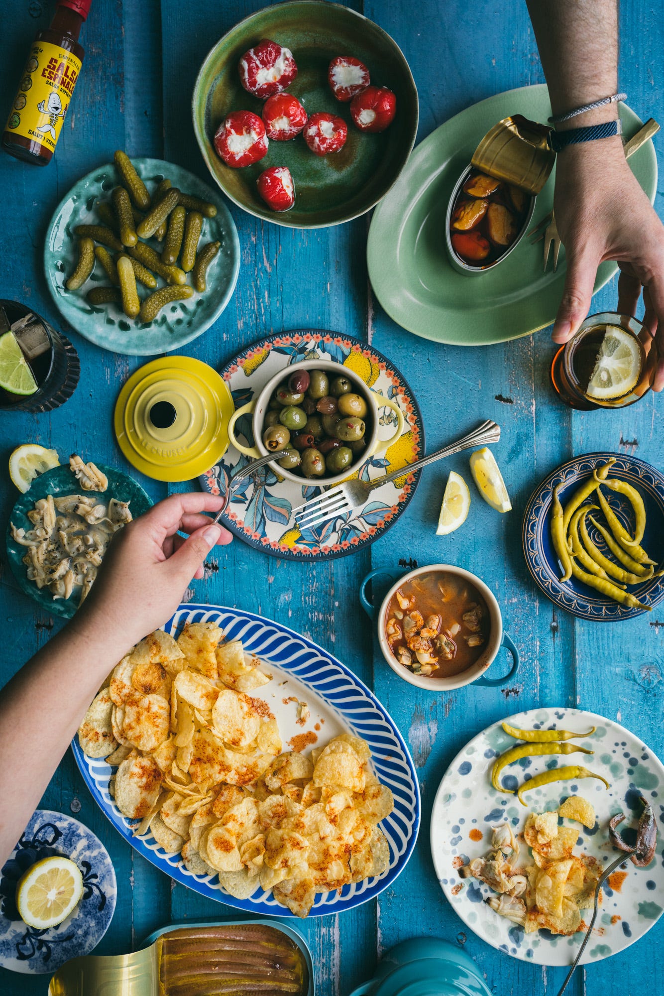
I knew my food would be yellow (potato chips), orange (mussels and sauce), red (peppers) and brown (anchovies), so I decided to keep all the props in a cool color palette this way the food would pop against them. I chose from my collection the plates and bowls that were ceramic, handmade and were in different shades of blue and green. Many of these I actually bought in Europe, so they were very fitting.
Recently I found this plate and fell in love with it. Because it was both blue (background palette) and yellow (food palette) I thought it would be great as an accent plate that would catch the attention of the viewer.

The composition
You can see the play with bigger and smaller plates as well as different shapes (round vs. oval). This brings dynamism to the composition.
In my last newsletter about photography I talked about different composition techniques. One was the Rule of odds. You want an odd number of elements in your composition as it will be more visually pleasing than an even number. See how there’s 3 bowls, making a sinuous curve. There are also 5 plates (without counting the lemon one). And in the final image you can see 3 lemon wedges and 3 green ingredients creating an arch (can you find them?).
The techniques don’t have to be followed to a T, but they help. Another one is Layering. Because photographies are 2 dimensional it helps a lot when you show the viewer some depth, especially in lay down shots (also called bird’s eye) like this one. This is why I styled the olives creating a hole in the middle (the ones in the bottom are darker and the ones on top highlighted), they are also in a bowl that is on top of a plate. And the mussels are on a platter rather than directly on the table. The potato chips were piled up to show the texture and to create shadows that would add dimension. Finally, the last layer was the sauce spilled on top.
It is also important to play around to see what looks best (and to look at what the camera is seeing because sometimes it feels different than what you are seeing). In the final photo I decided to place some of the food on the right low corner plate. This helps the viewer to imagine it’s not a set-up photo but a real scene in which people are enjoying that food (and actually my husband Ross and I did and ate it all afterwards!).
You can see below the composition changes that ocurred before the final image.
The Editing
Even if I would have liked to have strong shadows and highlights in this photo to signify a sunny day in Spain, when you work with natural light you are at the whim of the weather. It is really the only downside of it (because it’s free to use!). If it’s a sunny day and you need soft shadows, there are ways to modify that diffusing the light. But for a change, I wanted sun when I had clouds. I couldn’t get the hard light I wanted but I could make it feel warmer than it was. So I incremented a bit the light and the color temperature to pretend I was in Barcelona and not in Boston. Also, even in Barcelona there are clouds sometimes!
I always edit my photos in Adobe Lightroom Classic, and it’s a part of the process I love. The shooting is always stressful, even if you have planned it out as I did. You are still working with food and time is crucial. On the other hand, editing means all this work is already done and you can sit down by your computer with a cup of tea and do some magic.
In this case, apart from brightening the photo and saturating some parts, I also added some contrast and I made sure that the colors popped. With food you cannot go crazy with the editing because it still has to resemble reality and look appetising! But it’s a great tool to use for your storytelling. Don’t you think the final image is closer to the story of taking a vermut in front of the Mediterranean than the unedited one? It went from blah to ah!

I hope you enjoyed this edition of “How I Shot This” and you start recognising some composition techniques in other photos. Maybe you even feel inspired to try some of them out! If you do so, tag me on Instagram so I can see your creations!


You made these photos come to life. Love the vibrant colors!
Beautiful photos! Did I understand correctly that you did the whole shoot with natural light? Turned out great.