Behind The Scenes of the Crepes Photoshoot
From the idea that sparked the creativity to the set-up and editing
Every time you come across a beautiful and delicious-looking photo of a dish on social media or a magazine it’s been created very meticulously. Nobody just wakes up and has a plate with a perfectly styled avocado toast ready to be captured. If you do, you are probably rich and live with a cook (good for you!), but still, this doesn’t mean you’ll take a good photo.
The first time I took a photography course the teacher told me: you don’t take a photo, you make it! Even if it’s a fast shot while taking a stroll, you are making so many decisions: the subject to photograph (is it a flower, is it a runner, is it a car, is it a building), the angle (straight up, shot down, on 45 degrees) and the camera settings (you want the image to be still, to look blurry, to be close, to be far away). On the bare minimum.
For food photography, that sentence is even more significant. You don’t just take a conscious shot from something that caught your eye on the street, you really have to make that picture happen. You have to prepare the scene, choose the props that will go well with your subject, understand which light will be more flattering…
But let’s start from the beginning.
The first idea
There’s many different kinds of food photographers. If you are working on editorial work for a magazine or on product photography for a big brand it’s possible you have a food stylist and even a prop specialist. This means your only job it to take care of the photography. The styling of the dish and all the creative decisions around it are made for you.
This is not my case at the moment, and it’s not the case for many of the photographers you see on social media, professional or aficionados. So, how do you start?
The first idea that sparks all the creativity may come with the subject. For example, if I decide I want to photograph a warm soup this will lead to choosing a surface and other complementary props that convey the warm feeling of a house in winter. It will also make me opt for an angle that makes the soup look flattering, such as top down rather than straight up, because you would only see the bowl and not the soup then.
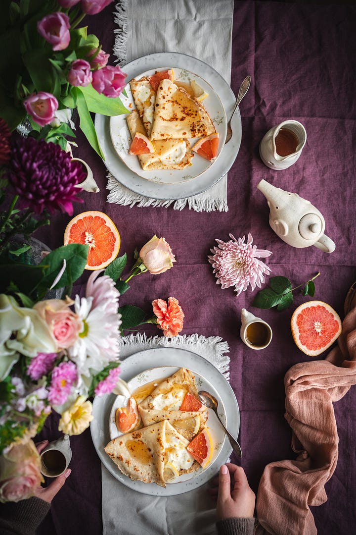
My first idea in this case came with an image I came across on Pinterest. I had decided I wanted to write a recipe of crepes and one that had citrus fruits, because they are in season at the moment, and I wanted the image to feel romantic as we were around Valentine’s Day. This color palette was soft, had hints of orange (which matched with the crepes) and was mixed with pinks and violets. I found it really inspiring so I knew I wanted to represent these colours in my image.


Choosing the props
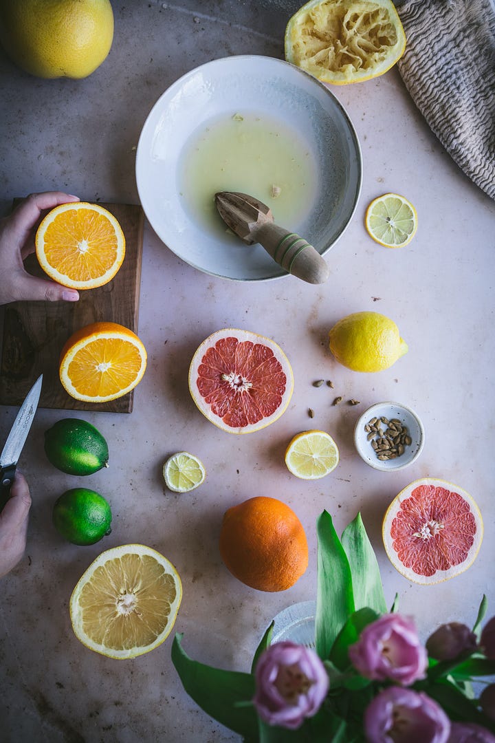
With the recipe in mind I needed to find supportive complements. The main subject, the one that needs to draw the attention of the viewer, is always the food (either the final dish or the ingredients), but photographing it on a white plain surface does’t always work.
With the objects we place on the scene we can help tell the story of the dish. In this case, I wanted it to feel warm and inviting and also romantic. I chose a backdrop that resembles Italian cream marble. I have lots of vinyl backdrops like this one because they are super light weight, they clean very well, and they are specifically made for photographers like me that don’t happen to have real marble in their house but actually just need a little corner to look like so. Cool, right?
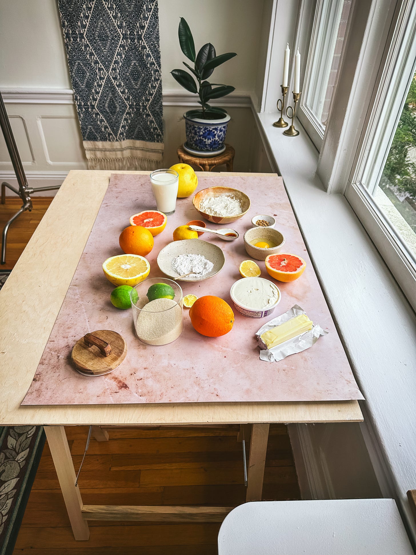
I checked that it looked nice with the citrus fruits and then I added up other objects to complement the scene. Such as a cutting board to show the moment of preparing the citruses, or a bowl to collect the grapefruit juice. I chose bowls and plates that would go well with this feeling of warmth and something being handmade with love.
For the final scene of the dish I styled two different settings. I knew I wanted one of the dish as the hero and so I placed it on top of a soft pink napkin and added some cut flowers to add to the romance. I also took another version with a deeper tea towel I bought in the MET that represents a flowery still life. Which one do you like better?
For the second final shot I wanted a table scene to represent these crepes being shared in a lovely table setting. Going back to the image that inspired the first idea, I decided to go with a darker background so the crepes would contrast and be more visible. I didn’t have any tablecloth that color, but I happened to have a lovely apron Ross got me for Christmas so I got creative!
Choosing the angles
Depending on the scene and the story you want to tell, the camera needs to be adjusted. For the scene of me sifting the flour, I needed to place the camera straight towards me and set it so it would start photographing on its own while I did the action. For this, I used the help of my tripod and the camera’s timer.
For many of the other scenes I opted for a top-down shot, quite a flattering angle for food photography as long as the subject is not layered vertically (like a burger, for example). It allows you to have a bird’s eye view which we don’t usually have in real life so it makes it really interesting.
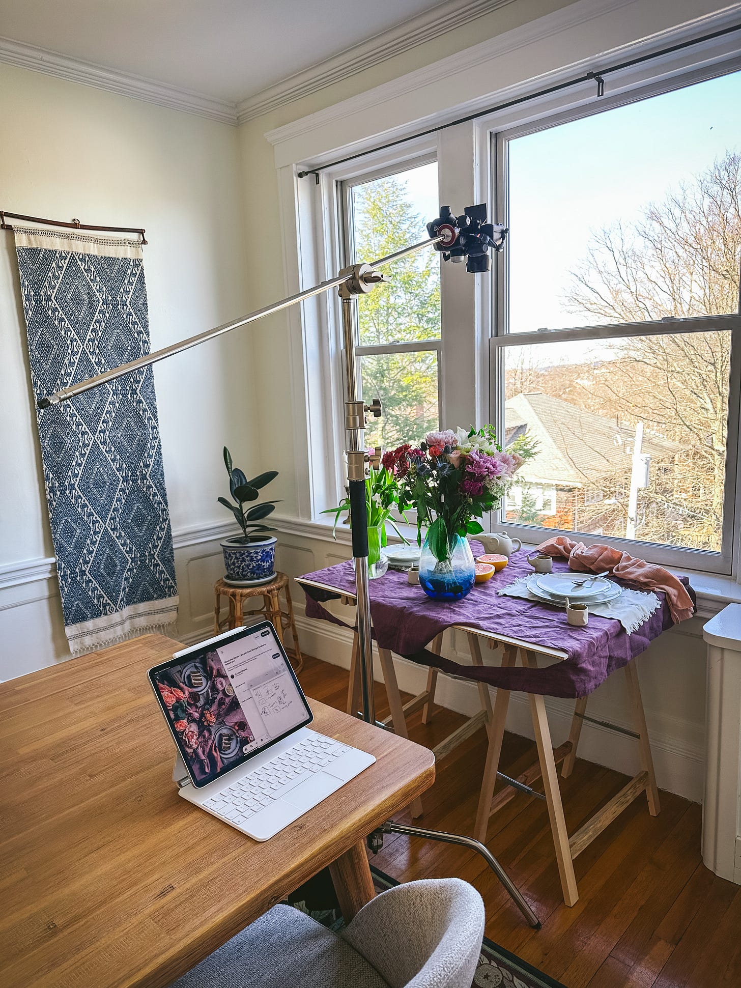
For the ingredient spread shot, I hand held my camera above the table but for the other ones I couldn’t as my hands needed to be in frame. For that I have quite a heavy piece of equipment that is fantastic. It’s called c-stand and it’s normally used to hold artificial lights, though food photographers figured you can also attach a camera on one side and place it on top of your subject. Again, with the help of the timer and an app on my phone that helps me see what the camera is seeing I get to do some magic.
A note on the light
I always shoot my images with natural light. I love discovering how you can shape it to your benefit, and also… it’s free! With food photography, the rule of thumb is that you need diffused light to illuminate your subject evenly and also to create some shadows to give it depth. You can play with direct sunlight as well and that can be super cool, but in general diffused light is the best.
The day I took this set of images it was a cloudy day, which was perfect because it means the clouds did all the work for me and diffused the sunlight beautifully to create an evenly lid image. For other days where I am burdened with bright skies (poor me), I have a diffuser screen that I place between the window and the surface. For many years I didn’t have such thing so I would use a sheer curtain or even a cheesecloth. It all works fine.
You will also notice that in most photos the light comes from the side. This is also a rule of thumb for food photography. This way, you have a side that is illuminated and one that is in the shadow, which creates contrast and depth. It makes it more dramatic and real. Again, you can also play with front light or back light but in most situations, a light source that comes from the side it’s the best option.
The final step: the Editing
This is one of my favourite parts of the creation. For me, it means “stress free”. I make myself a cup of tea and head to my computer where I can be playing with an image for hours.
Until this point, I’ll be honest, it can be a bit stressful. The pre-production (going grocery shopping, deciding on surfaces and props, cooking the dish, styling it) is a lot. And then the time to take the photo (or photos, which is normally the case) is also a lot. I work with real food, that later on I eat, so there are no tricks to make ingredients stay put and if I ever show whipped cream you can be sure it’s going to be edible and not the shaving kind.
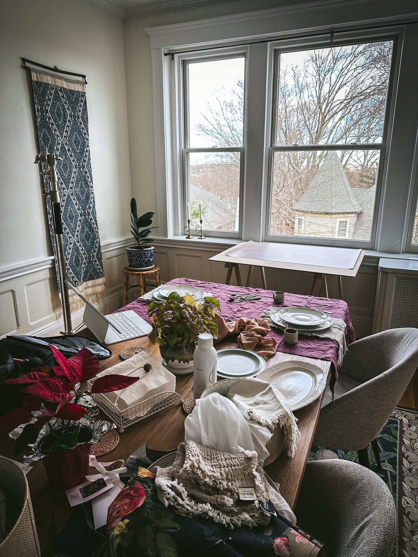
This means I need to be organised, fast and to the point. And still, after hours of preparing and shooting, there’s then a mess that needs to be cleaned up. Normally at this time I take a break, put the kettle on and go to my computer. First reason is that I need to sit down and rest. Second reason is that I am too excited to see how the images look on a big screen!
The editing is part of the creative process. It is not cheating as putting an apron to appear as a table cloth is also not cheating. The reason why it isn’t is that nobody is trying to make it look natural, as if it was casually there. All these photos were very well thought out, planned and created. So the post-production part, the editing, is also part of it.
I use the tools available on a program called Lightroom to highlight my subject or to help me convey the main feeling of the scene. I may choose to put a vignette around the frame so it feels more inviting and the eye is drawn to the center. Otherwise, I may choose to keep it very bright and airy if the theme requires it.
In this case, I mainly highlighted the citruses and gave the scene some contrast and warmth. When I shot this it was a cloudy day so the color temperature was rather cold. I didn’t want to convey a cold feeling with these images so I changed that a bit.
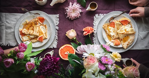
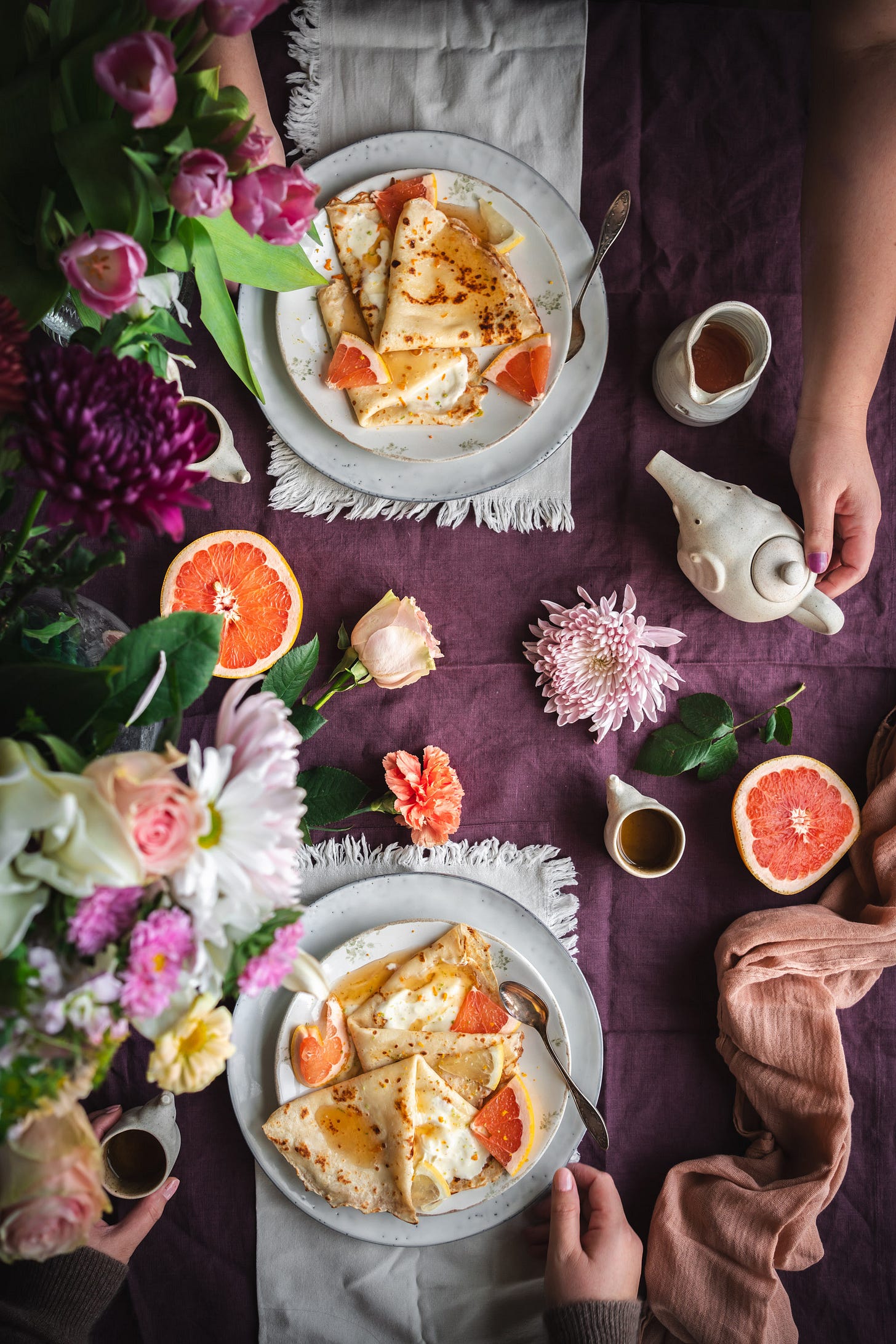
With the final image of the table where the crepes were shared, I really wanted two sets of hands to show that there was at least two people seating on that table. But it was only me at home that day so I used the editing tools to my advantage. I took several photos of the same scene. In one, I was at the top side with my leaves pulled up and touching the tea pot as if about the serve some tea. In the other, I was on the other side of the frame, with a cozy sweater on and keeping my hands on the plate to create a triangle that would draw the vision to the subject (the crepes).
After some first adjustments of color and light on Lightroom, I took both versions on Photoshop and I united both images into one. This was my favourite image to create of the set. It was the one that inspired the full thing with the color palette and it just makes me happy. It transports me to a beautiful morning in which you share these delicious crepes with a loved one. Surrounded by flowers and a warm cup of tea.








These photos are SO beautiful! Which app did you use to see what you're camera is seeing?
Thank you so much!! I have a Sony camera so I use their own app, it’s called “Imaginong Edge”. But I know Canon also has its own app and I guess Nikon must have it too.