


Making Home: Dream Studio Makeover (Part 1)
Transforming a carpeted guest bedroom into my dream photography and writing studio — from the floors to the walls

This is the first issue of a new series I’m calling “Making Home,” where I’ll share the transformations of our 1980s house in Massachusetts as we make it our own.
If you’re new to the newsletter or just an occasional reader — welcome! Let me give you a bit of context. My name is Eli (Elisabet), and I’m from Barcelona, Spain. In 2023, I moved to Boston with my husband. After two years of renting and watching money go down the drain, we decided it made more financial sense to invest in a home — even if we don’t plan on staying here long-term. You can read more about our decision and the process of buying a house in Massachusetts here.
Long story short, we now own a two-story house with a small garden and lots of potential! The house was built in the '80s and is in great shape, though a bit dated. The first thing we did — even before moving in — was rip out the carpet in the two bedrooms and plaster over the popcorn ceilings that spanned the entire house.
We moved in this past May and have been slowly unpacking ever since, taking weekly Saturday trips to the recycling center for two months straight. I feel like we’re finally settling in, which means we can start working on each room. Some will only need small updates — like our bedroom, which, aside from the carpet, was already fantastic. Others, like the two bathrooms, will need a lot more attention.
Feeling a bit overwhelmed by all the projects we wanted to tackle, we decided the most logical place to start was my office. Since I work mostly from home as a photographer and writer, I needed the space to be functional right away.
The space
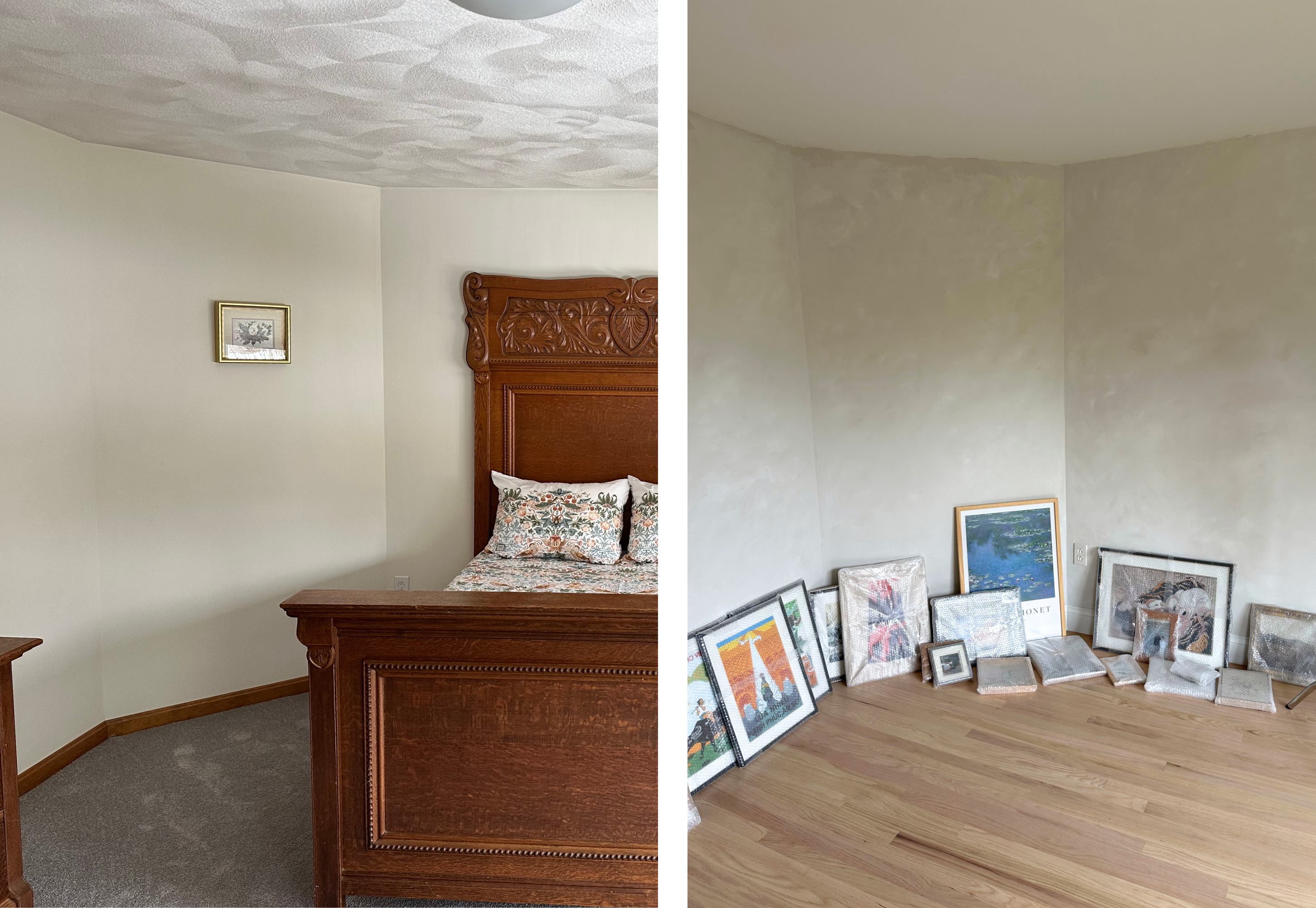
When we visited the house, this room was carpeted and held a large wooden bed and chest. It was quite bare, so even though the gray carpet and popcorn ceiling weren’t my style, you could still see how bright and spacious the room was.
The room has three windows — two side by side forming a long rectangular shape, and a third one on the adjacent wall. All three face the back garden and get beautiful southwest light.
There’s also a huge closet area. When we first saw it, it was also covered in gray carpet and closed off by double bifold doors. The main room was painted an off-yellow, and the closet a deeper shade of yellow. Despite the generous size, it all felt a bit claustrophobic.
As I mentioned earlier, before moving in, we removed the carpet and had the ceilings plastered over. Ross and I handled the carpet removal ourselves — saving us $700! We left the more precise jobs, like installing the new hardwood floors and plastering the ceiling, to the professionals.
Removing carpet isn’t difficult, but it is messy. You’ll need a good mask, gloves, and protective glasses. You’ll also want a utility knife with a sharp blade and a crowbar. Start by cutting into the carpet and pulling it up from the corners, then roll it into manageable sections to discard. Next, remove the underlayment layer, which usually comes up easily without a knife.
Once the plywood is exposed, you’ll need to remove all the staples that held the carpet in place. A crowbar can help scrape them up, or you can pull them out one by one with pliers. Since we only had one crowbar — and Ross was using it to remove the spiked tack strips around the room — I tackled the staples with pliers. It was tedious but oddly satisfying.
Once the floor was cleared, the specialists came in to install the new hardwood planks. We chose red oak to match the rest of the house. Since we planned to sand and refinish the original floors, we went with a natural finish in the bedroom too. Now it all looks seamless — as if the room always had hardwood floors!
The idea: A studio-office-guest bedroom
One of the items at the top of my personal wishlist when house-hunting was to have a dedicated space I could use as a photography studio. I’m a photographer, mainly focused on food, so ideally, this space would be close to the kitchen. In the past, I’d kept my desk in the guest bedroom and shot in the kitchen or dining room, setting everything up from scratch for each session — props, tripods, surfaces — and then tidying up immediately after. It was doable (I even wrote a newsletter about how to make it work!), but it required a lot of extra time and energy.

So the idea of having a space just for photography — with everything set up and ready to go — felt like a dream. After seeing many houses, we chose the one we now own because it was the best overall fit; however, it meant compromising on some of my wishlist items.
The biggest compromise was a studio by the kitchen. I had hoped for it, but the room that made the most sense for my workspace is on the second floor — a full flight of stairs away. Still, I’m finding ways to manage. For more involved shoots, I can always fall back on the dining room setup that served me well for years.
Another compromise was the guest bedroom. As foreigners, having a place for visiting friends and family to stay has always been important to us. Every apartment we’ve lived in has had a second bedroom that doubled as a guest room and office.
At first, I assumed we’d do the same here: use this room as a guest bedroom with my desk in a corner. I figured I wouldn’t have space for a bed and a dedicated photography area. But not long after we moved in, Ross surprised me by saying: “Hey, this is not going to be a guest bedroom, it’s going to be your space. How many times do we have guests versus how many times are you going to use it?!”.
It may sound simple, but I’d never really considered that. I had never prioritized my work over the idea of having a space ready for guests. I’d always adjusted my needs to the space — not the other way around.
Suddenly, a world of possibilities opened up. I began to visualize the room not as a guest bedroom with a desk squeezed in, but as a fully creative studio space that could transform into a guest room when needed — with a sleeper sofa, for example.
It was no longer an office/studio squeezed into a guest bedroom. It was a studio/office that could accommodate guests! The priorities finally felt clear. I was excited — really excited! — and I started designing my dream space.
The design plan
The first thing I do when designing anything — whether it’s a room or a photoshoot — is gather inspiration. So I turned to Pinterest, Instagram, and the studios of food photographers I admire to see how they had set up their spaces.
Then, I paused to reflect on what I needed this room to do for me. I made a list — not just of furniture or aesthetics, but of functions. I wanted to make sure the space would be not only beautiful but also functional.
Here’s what I came up with:
List of things needed in this space:
Desk area: A place for my computer, where I can write, work, and edit photos. Ideally by a window, since nature inspires me and helps me focus.
Open area for photography: A flexible zone large enough to hold a table or surface for styling and plating dishes. This needed to be close to a window for natural light photography, and ideally with a clean wall behind to use as a background.
Props area: A dedicated spot to store and organize all my photography props — ceramics, glassware, cutlery, and more — so everything is visible and accessible.
Photography equipment storage: A space to keep my gear — cameras, lenses, tripods, reflectors, clamps — organized and protected, but also easy to grab when I need it.
Books area: A small library for my reference books and cookbooks, to consult whenever needed.
Backdrop storage: A way to store my vinyl backdrops flat or hanging, ideally not rolled, so they stay in good condition and are easy to access.
Sofa area: A wall for a sleeper sofa that could double as a guest bed when needed, with enough clearance in front to open it comfortably.
Drawers: Storage for smaller items like cutlery, notebooks, pens, and tools I use frequently.
Moodboard area: A space near my desk for a pinboard, where I can build visual stories, collect textures, or plan shoots — a space that keeps me inspired and focused.
Display area: A shelf or section to display art, objects, or favorite books — things that give me a creative push just by being present.
I knew fitting all of this into one room would be a challenge, but having this list helped me prioritize and approach the design intentionally. It wasn’t about stuffing everything in — it was about making the space work in harmony, with each zone serving its purpose while keeping the room open and inspiring.
The direction
Once I had a clear idea of the functions the room needed to serve, I could focus on the style — the atmosphere I wanted to create. I envisioned a space that felt like a creative realm the moment I opened the door. Something that gave me the same feeling I get when I walk into a pottery studio or an art atelier: a place where beautiful things could happen.
So I started gathering inspiration, specifically looking for atelier-inspired interiors. From that search, I created a moodboard that captured the feeling I was after.
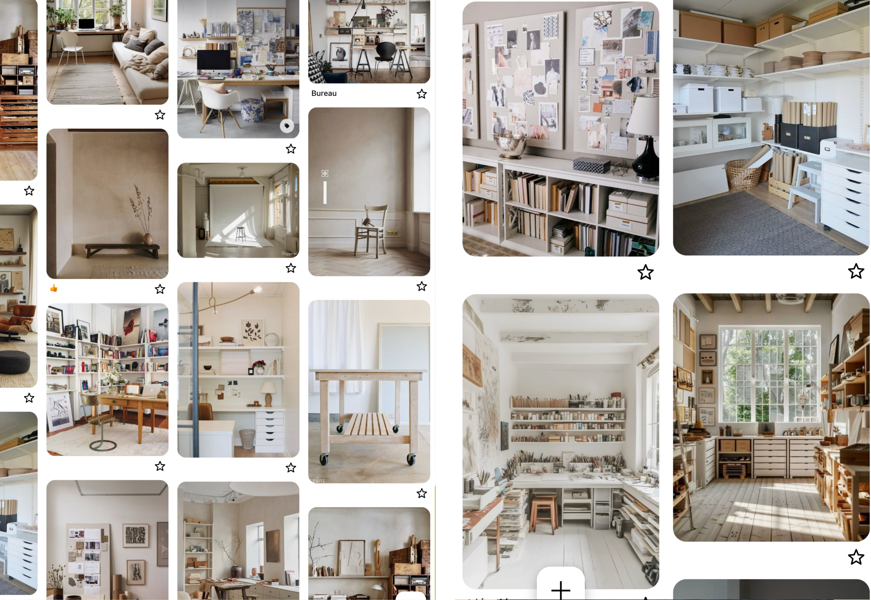
What all these images had in common was a light, natural color palette and thoughtful, functional storage solutions — right down my alley.
Since the walls would also serve as backdrops for my photography, I wanted to make a choice that added visual interest without overwhelming the space. The goal was to keep it harmonious and calming, but with enough texture and detail to inspire creativity.
The AI renders
Once I had the idea structured in my mind, I turned to ChatGPT and asked it to create images based on the vision I had. I uploaded a photo of the room in its original state and gave prompts like, “Transform this room into a photography studio with an atelier-inspired look.” It generated several images — some more accurate than others — but they all helped me begin to visualize the possibilities.
The closet area, in particular, had a lot of potential. But I needed to be strategic about how to use it in order to meet all my storage and functional needs. Once again, I asked ChatGPT to show me different layout options, and for several days I considered what might work best — browsing online for specific furniture pieces and storage solutions that could bring the vision to life (stay tuned to Part 2 to see how it turned out!).

Transforming the walls with a limewash DIY effect
Before committing to a specific closet layout, I knew I needed to paint the room and get it prepped. I decided to take on the project over Memorial Day weekend (the fourth weekend of May), and — as DIY projects often go — it ended up taking longer than expected. That’s because I chose to try a new technique that would completely transform the space: limewashing.
I had never painted a room before, but I knew this was a DIY I could handle — a chance to learn something new, feel creative, and save money all at once.
I started with the closet area, partly because it was tucked away (so if I made any mistakes, they’d be less noticeable) and partly because I needed at least one finished space to move all the boxes that were still scattered around the room. (We have only finished unpacking everything from the move two weeks ago!)
The closet had been painted a dull yellow, and since it doesn’t get any natural light, I figured white would help brighten it up. After testing several shades, I settled on White Sand by Sherwin-Williams. I prepped the space and rolled the paint on — the process was quick since I used a paint-and-primer combo and gave it two coats to fully cover the yellow.
I actually finished painting the closet about a week before Memorial Day weekend, which gave me time to move all the boxes in there and clear out the main room. Prepping for the bigger space took quite a bit of effort — I made sure the entire floor was covered, and I carefully taped off the window and door trim. It was a time investment, but necessary.
The tecnique
One element that kept appearing in my atelier inspiration photos was limewashed walls. Limewash is a natural paint made from limestone that gives walls a soft, chalky, and slightly textured finish. It’s been used in Europe since ancient times for its breathable, matte aesthetic. It was exactly the kind of subtle texture and movement I wanted for my walls — but once I did the math, I realized that using real limewash would be quite expensive…
Then I came across this video by Rachel from Two Loves Studio, who had created a DIY limewash effect in her small home studio. I was instantly intrigued. She had gone with a dark mauve tone, which looked beautiful. I also considered deep blue walls, like the ones Eva Kosmas Flores has in her new studio. But ultimately, neither color felt quite right for me.
I settled on two complementary shades: White Sand (which I had already used in the closet) and Limewash by Sherwin-Williams. It felt fitting — and a little poetic — that the darker tone shared the name of the effect I was trying to recreate.
With true limewash, you typically use just one color, and the variation comes from how it dries. But since I was using regular matte paint, I needed to manually create that variation by layering two tones and building in texture with each brushstroke.
Here’s how it works: you don’t actually mix the two paints together. Instead, you pour them side by side so they touch, and then dip a wide brush into both. On the wall, you create soft, organic shapes — almost like stars or clouds — and then blend the edges of each one with the next. I found that blending worked best when I used the sides of the brush, but it took a fair bit of trial and error to figure out what technique worked for me.
The first coat mostly served to cover the original color. I could have done a solid base coat in white first, but I skipped that step — which turned out to be a good way to practice and learn the movement of the brush. This is very much a “trust the process” adventure.
Each coat took me two full days. It was intense, physical work — every stroke had to be intentional, not just to apply paint but to build a pattern I’d be happy with long-term. By the end, I developed a mild case of tendinitis and my hand was swollen for two days!
On the final day of my four-day painting marathon, I tackled the ceiling. I painted it white with a roller, which was tricky in a different way — mostly because I struggled to distinguish between the white paint and the plaster, so I couldn’t always tell which areas I had already covered. But two coats later, it was done.
Touch-ups came next, especially along the edges where the walls met the ceiling. For some reason, the painter’s tape I had placed to protect the limewashed walls peeled off some of the paint and disrupted the effect I’d worked so hard to create. I was honestly pretty upset. I touched it up the best I could, but it didn’t look as seamless as before. Ross reassured me that only I would notice — and I try to believe him…
My proudest moment came when a contractor visited the house for another project and paused to admire the walls. He complimented the finish and said he’d never seen that technique done before — it felt like the ultimate validation!
If you love the look of limewash, I really encourage you to try this. It’s hard work, yes — but very rewarding!
Next up
In Part 2 of this makeover I’ll show you how I transformed the closet space to meet my storage needs — and you’ll see if the result looks at all like Chat GPT’s render!
I’ll also show you the new desk I got and how I transformed the rest of the space to become my dream photography studio!
Stay tuned and comment down below if you would have done something differently! I’d love to hear your thoughts!
I loved seeing your home transformation! Makeovers are so much fun :) (I may be wrong but are your ceilings okay? I thought "popcorn ceilings" were a sign of asbestos.)
Looks great, Eli!